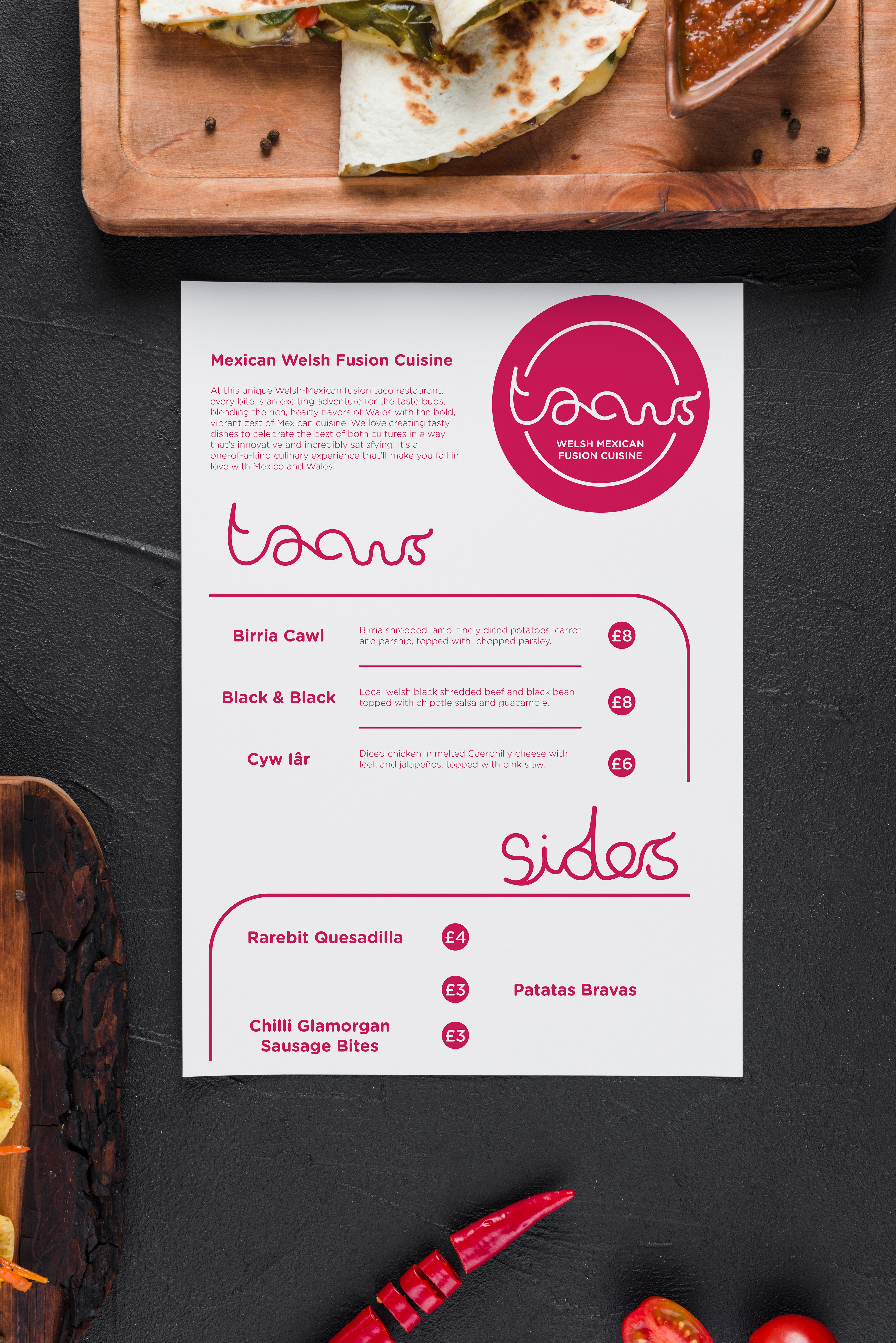
Brief:
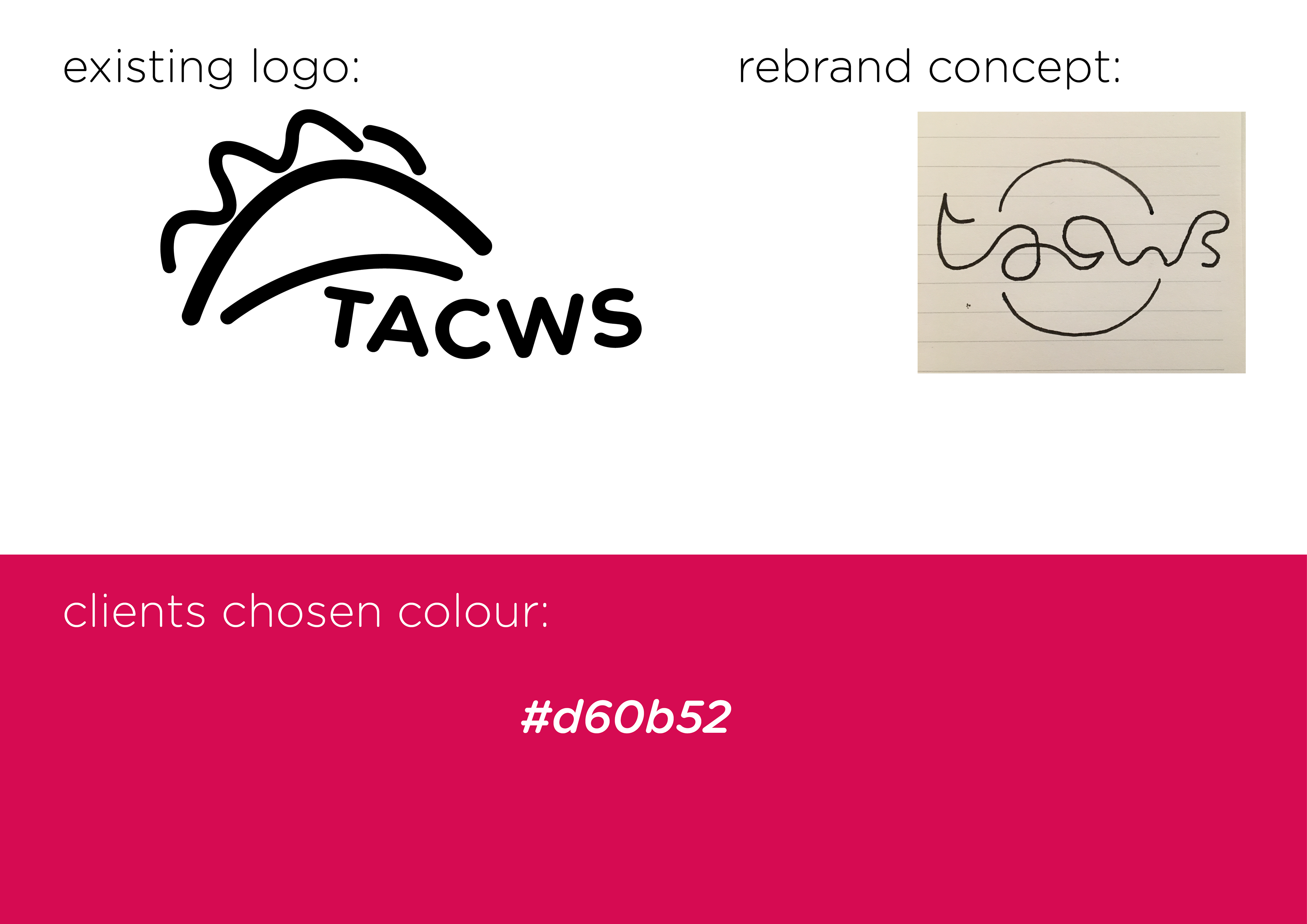
I was asked to create a fun brand that didn’t lean on stereotypical Welsh or Mexican iconography. The client wanted it to feel modern and appeal to a festival going crowd.
Research:
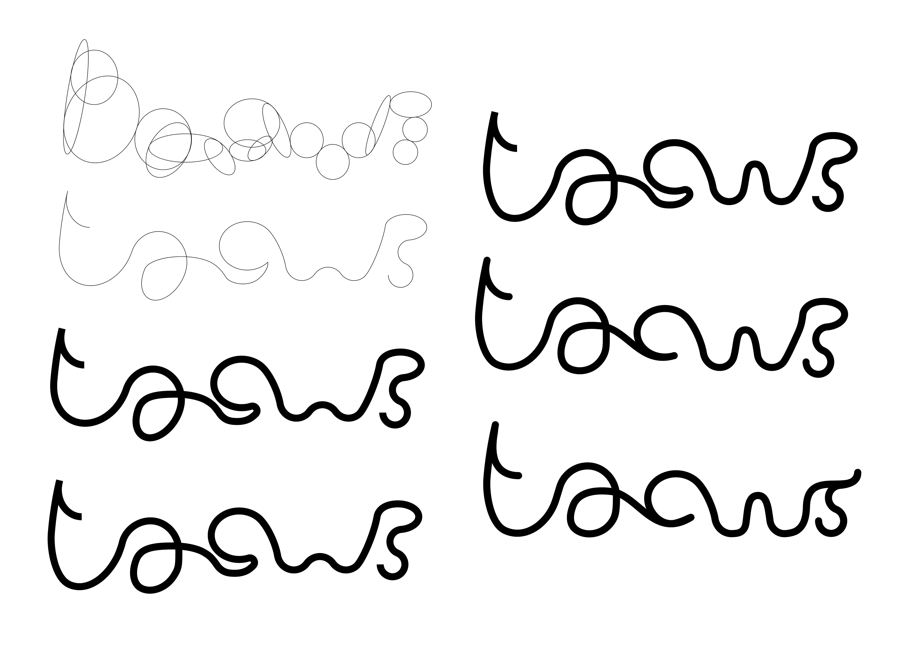
The brand needed to stay simple to help stand out form the competition and appeal to the target market.

Solution:
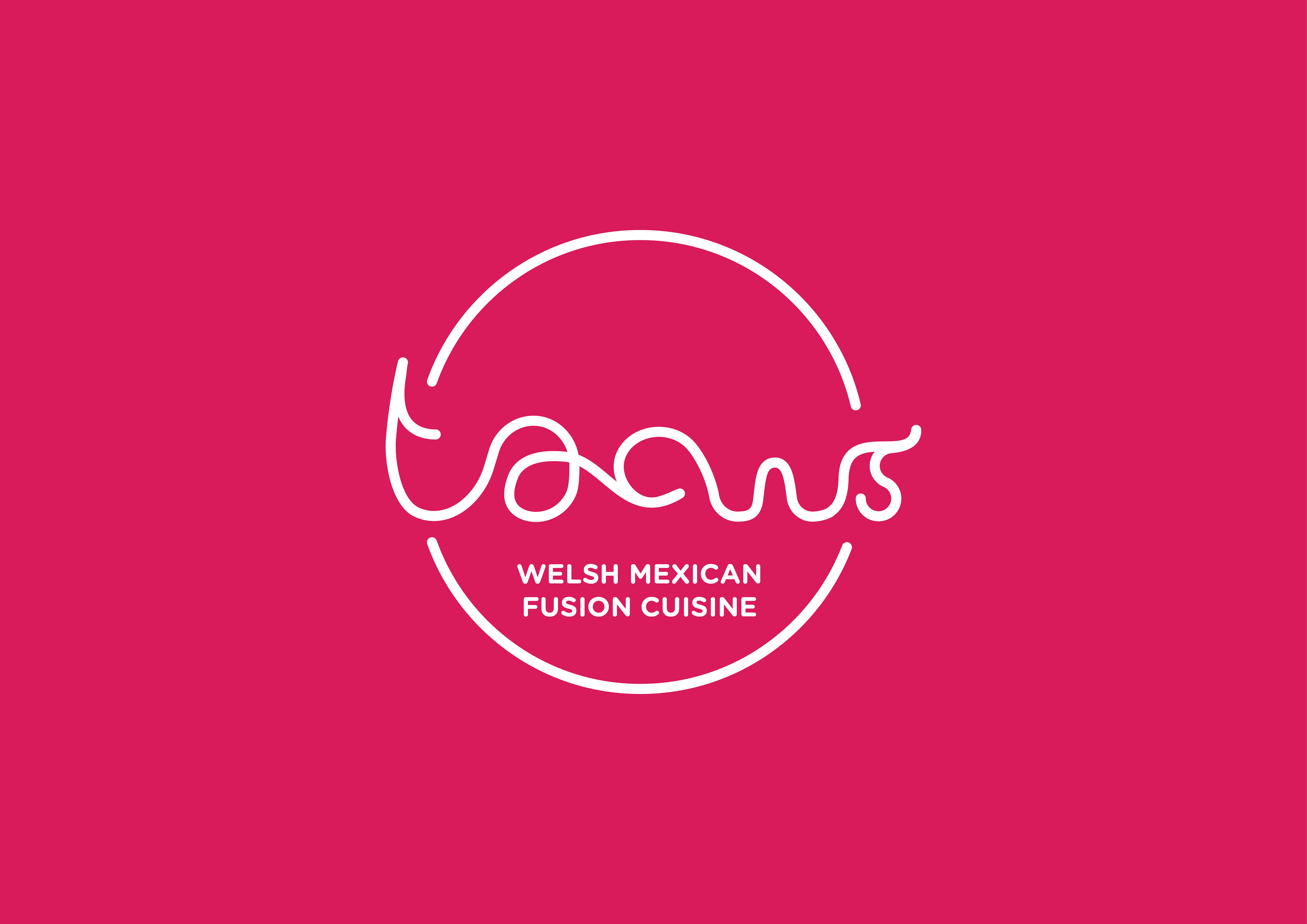
The client had an affinity with the choice of red used and I felt white paired with it well. I created a bespoke logo type that was placed in a circle to mimic a taco being viewed from above.