Brief:
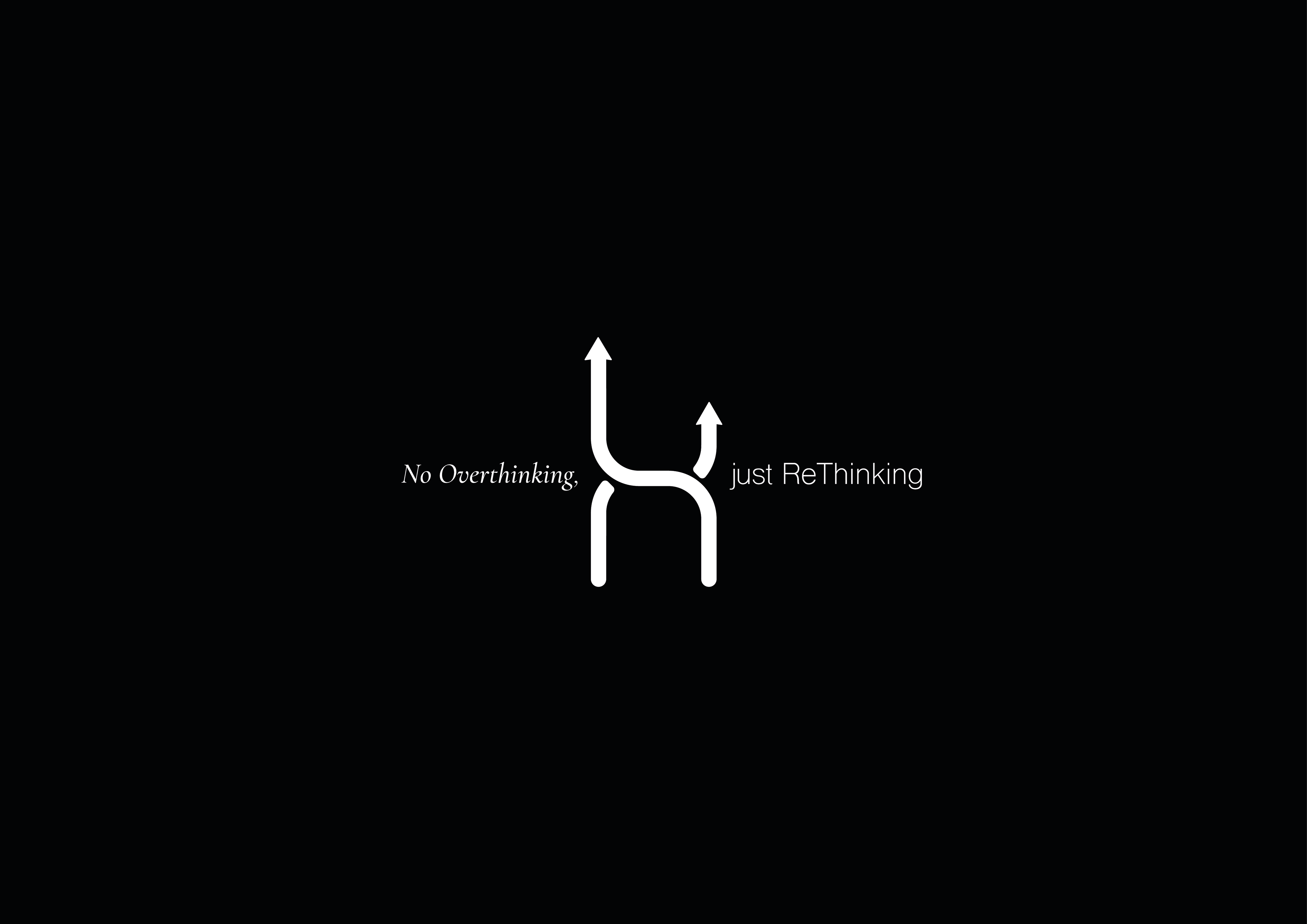
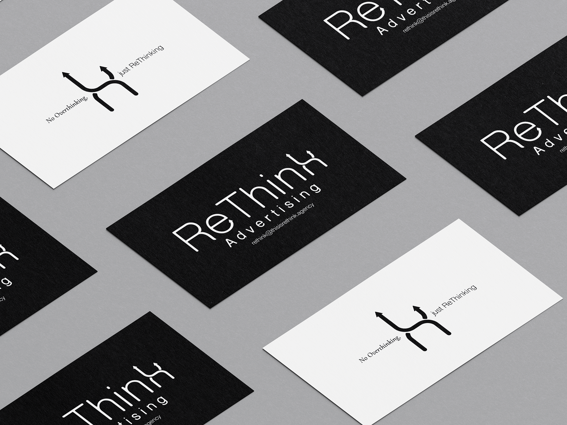
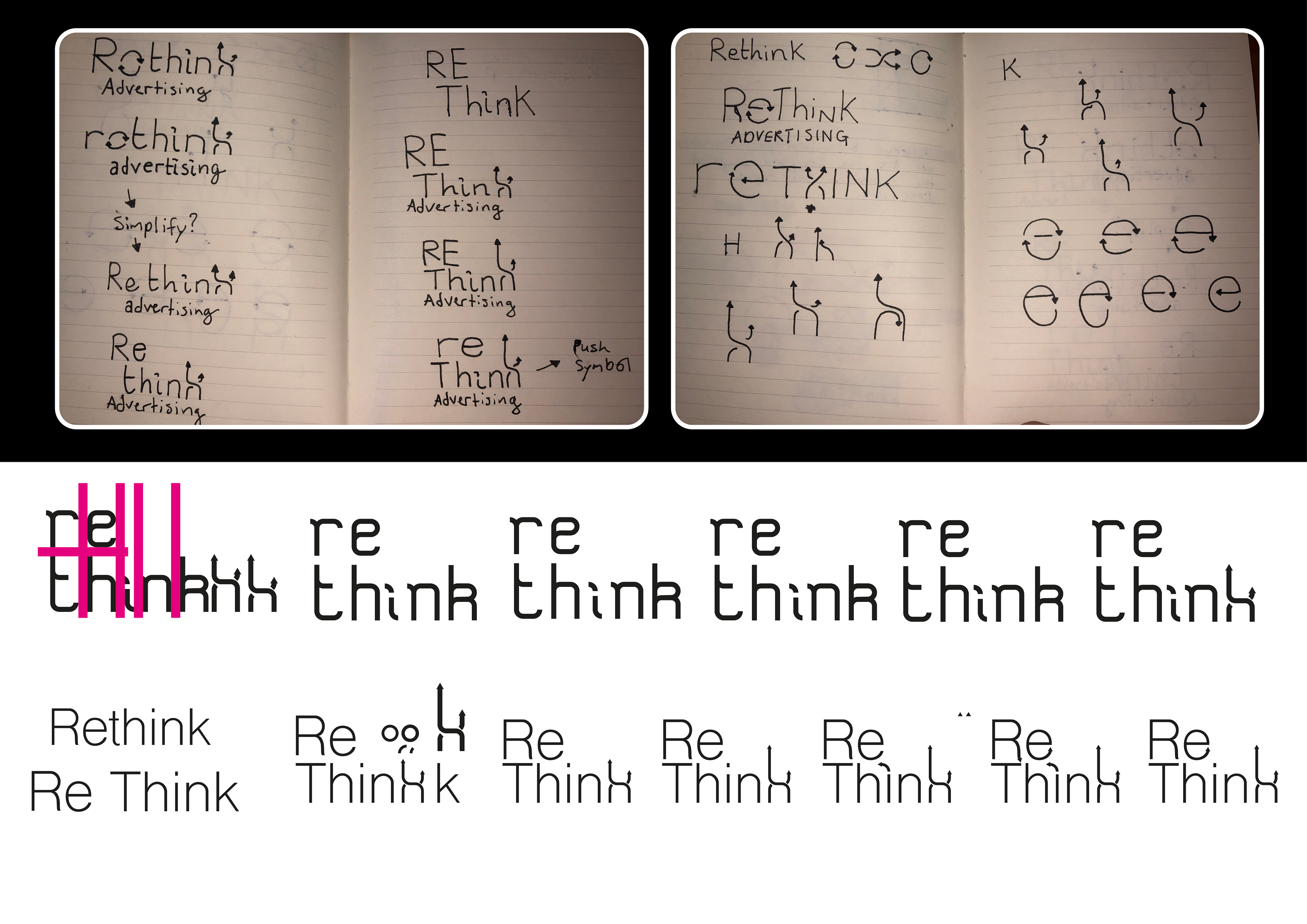
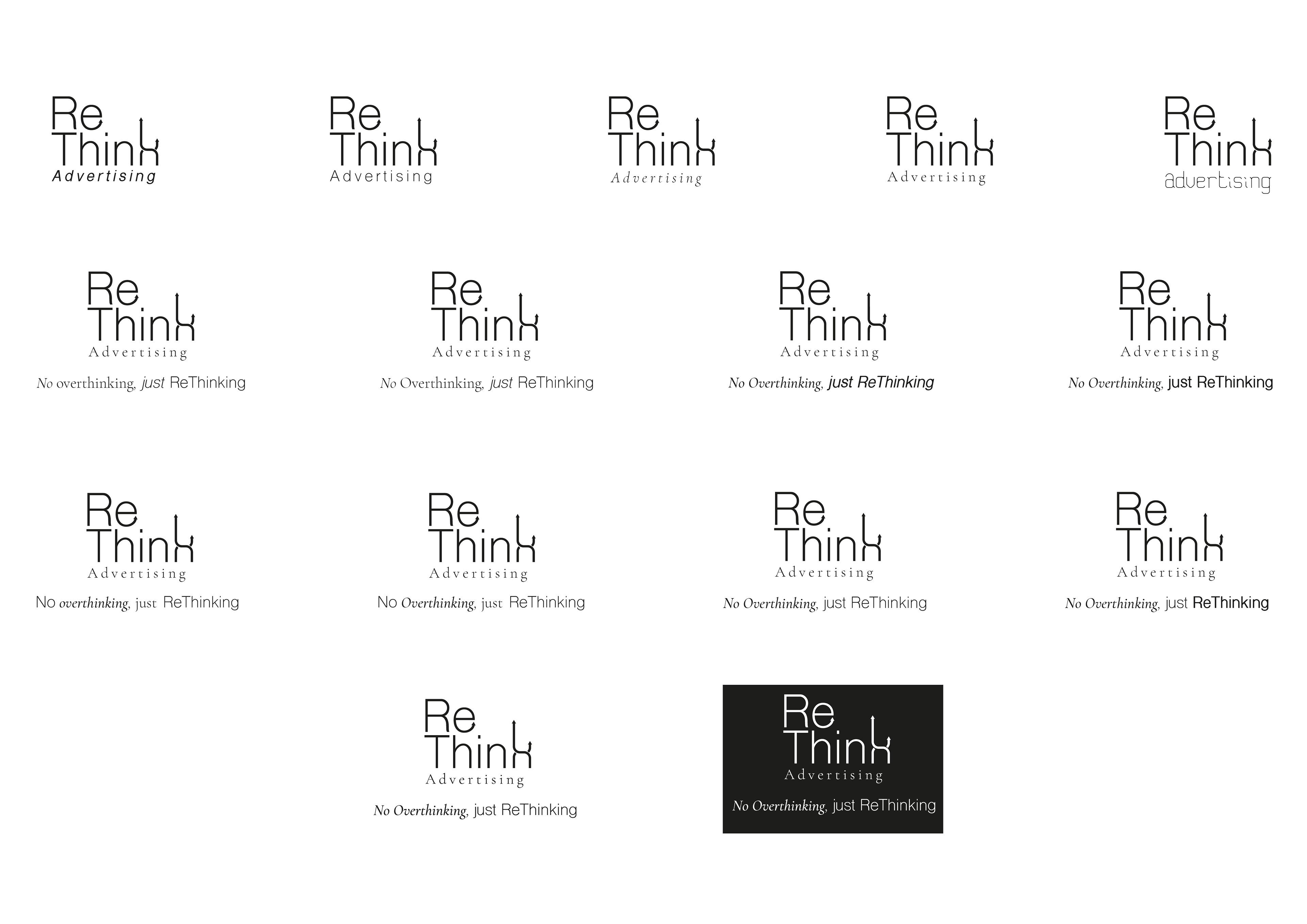
During my undergraduate degree I was able to work with advertising students. This brand is an example of working with one of them as a client. They wanted a black and white colour palette to convey their transparency as an agency.

Research:
Tertiary research on other advertising companies showed me that I should use a strong logo type. The client provided the name Rethink, so I expanded on the language associated with this by making a key work matrix.
Solution:
The client wanted the idea that the agency was here to 'shake things up' encoded into the brand. This was achieved by using arrows heads integrated into the logo type.